Interesting Kenyan Sites – Best of 2010

A while back, we started a small experiment where we’d write about cool Kenyan sites that we had come across. This experiment quickly got a life of its own and became a permanent weekly feature on Like Chapaa (thanks to all of you!).

Here are the 10 best sites that we covered in the year that was 2010:
(in no particular order)

  • GetH20 – A (serious) game which simulates the complexity of life in the slums, the scarcity of resources, how to deal with them and prevent escalation of conflict. More.
  • EasyFax – this is a website that provides virtual fax services, in Kenya! More.
  • Nairobi Swahili this is the website of one Oloo, a Swahili teacher in Nairobi. More.
  • Mara Enkipai a website of the Mara Enkipai Safari camp. More.
  • Zynde – helps you manage your money better. More.
  • Mukuru – allows you to quickly and easily send money to Kenyan mobile phones. More.
  • Zetu – made in the mould of www.groupon.com, offering deals whereby you can buy stuff at discounted prices. More.
  • GotIssuez – this is a place where you can rant and rate issues that affect you. More.
  • eManamaba – promises to make travel simple and hassle free. More.
  • BidhaaTele is a massive marketplace where you can find bidhaa tele to buy. More.

The Worst Offenders

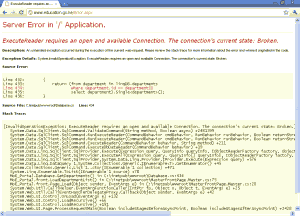
Kenya Ministry of Education website FAIL

The Ministry of Education - click for larger image

  1. Zuqka – the lonely spam planet. More.
  2. The Kenya Revenue Authority – navigating it is like solving a puzzle. More.
  3. Miko Sonko – you’d expect better from THE Sonko. More.
  4. The Kenya Teachers’ Service Commission – nothing short of shameful. More.
  5. The Kenya Ministry of Education – does it even work? More.

What do you think of our list? Did we miss anything?

May you all have a lovely 2011! See you next year.
Interesting Kenyan Sites #6

Easy Fax – this is a website that provides virtual fax services, in Kenya! I must say that the site is pretty well done and the user experience just seems miles ahead of most Kenyan offerings, kudos to the people behind this. Now you can receive faxes for free, via email, in Kenya. Check it out.

Kenyan Listings – well, I would say that directory-type sites in Kenya have a heck of a lot of competition. It shouldn’t be a reason not to try make one successful, though. Kenyan Listings seems to be well done and functional. Good luck to them.

Flops
Penumos – this is just a shamefully poorly made website – made by a supposed web designer!!! yet another reason why you should be careful who you hire to do your web design.

Mike Sonko – for a supposedly filthy wealthy individual, you would expect a better designed website, no? Hopefully it’ll get a face-lift soon.

Special thanks to Jaffar Mohamed and Shiko Nduta for contributing to this week’s article.

Update 29/9/2010: The Penumos guys have promptly updated their site.

5 Rules For Your “About Us” Page

Seth Godin shares some wisdom on how to build effective “About Us” pages for our websites. This page is often one of the most important pages on any website but also one of the most poorly done pages. Here’s what Seth has to say:

When someone comes to your site for the first time, they’re likely to hit ‘about’ or ‘bio’. Why? Because they want a human, a story and reassurance.

Here are some helpful guidelines (okay, they’re actually imperatives):

1. Don’t use meaningless jargon:
… is a recognized provider of result-based online and mobile advertising solutions. Dedicated to complete value chain optimization and maximization of ROI for its clients, … is committed to the ongoing mastery of the latest online platforms – and to providing continuously enhanced aggregation and optimization options.

2. Don’t use a stock photo of someone who isn’t you (if there is a stock photo of you, congratulations). The more photos of you and your team, the better.

3. Make it easy to contact you. Don’t give a contact address or number that doesn’t work.

4. Be human. Write like you talk and put your name on it. Tell a story, a true one, one that resonates.

5. Use third party comments and testimonials to establish credibility. Use a lot of them. Make sure they’re both interesting and true.

Seth Godin.

6 Reasons Why Your Website Sucks

You’ve been working really hard on your website; You’ve made sure that every pixel is perfect; every image magnificent; and every word amazing. Unfortunately, it’s too easy to make a beautiful website that, well, sucks. Here are some reasons why your shiny new website may suck:

  1. Bad design – unfortunately, this is all too common. We may not say it out loud, but web surfers actually do prefer well designed sites that are easy on the eye. Use a good color scheme and a proper contrast between the background color and the text color. A simple site re-design may increase your site’s usability (and likeability) greatly.
  2. Your website isn’t findable – if people cannot find your site on search engines or elsewhere then they cannot possible view your site and appreciate all the hard work you put into it. Some of the biggest companies in the world have websites that aren’t well optimized and they still get found. Unfortunately for the rest of us, that isn’t an option. This is especially a problem for gorgeous sites that are all flash and only have one page for Google or Bing to index. Please take time to do SEO.
  3. Your website only talks about you and your achievments – it is nice to tell visitors all about you. But, honestly, most people do not care all that much about you. They care about how you can solve their problems. Don’t just talk about who you are and how cool what you do is – take time to also include information on how you can help me, examples of how you have helped people in the past, etc. It is important in winning visitors over.
  4. People do not know what to do – people surfing the Internet have a very short attention span. If you make your website so “cool” and so “unique” that people do not know where or what to click on to get more information, you will not engage your site’s visitors, you will lead them away. No matter how unique you want the site, take a moment to think how to make it easy and intuitive to use.
  5. Your website automatically plays sound or video – Maybe you have an auto-playing video or some funky background music, but it plays instantly. Your prospects probably don’t suddenly want a blasting presentation to come out of their computer speakers while they’re sitting in quiet offices or a library. They’ll quickly close the browser tab rather than becoming engaged, filling out lead forms, and eventually buying your product or service. It also wastes bandwidth for people using services like Safaricom’s bambanet.
  6. Outdated information – If I’ll enter a website and I see in at the bottom that it says “Copyright 2004”, I will be quick to leave. No one wants outdated information. Not only that, it gives users doubts about you: are you careless enough to tell me that the date is 2004 when we’re in 2010? I won’t do business with you!

Websites Are Overated

When setting up a website, it will be more profitable for you on the whole if you prioritize getting good content down before you go into the nitty-gritty of what the site should look like. Most people spend too much time worrying about how the site looks and fail to give the same attention to the content of the website.

Advertisement experts recognize the value of quality content. It is best to get your message out to people in a clear way so that they can understand. In the ad world, ads are constructed around a central concept. This concept must be translatabled into language your customers can understand before you even begin to elaborate on it. Unfortunately, many people spend too much time on fancy designs and features when they move into online marketing tactics. This is reflected when customers visit websites seeking more information about a good or service of interest and find the sites useless.

Since this is such a basic principle of advertising, it is difficult to know why companies have not integrated the formula of great content/good design onto their websites immediately after creating them. The best designed website in the world will fall flat if its content is nonexistent or poorly written. Especially when pitted against an ad with simply “good” copywriting.

So, why invest more time and effort into your content before you have constructed your entire website? People are sophisticated. By throwing up a smokescreen of flashy design and empty content you are ultimately discrediting yourself and your product, as your customers will be able to see through the show to the lack of content within. When people are making decisions about items important to their lives, they like to feel as though websites have informed rather than entertained them.

Also, writing is a solid foundation for anything online. Your main mode of interaction with your website-browsing customer is the content he or she is reading online. Think about it: would you rather buy from a website with beautiful graphics that offers no real information? Or would you rather buy from a website with rather plain design but clear and thorough information about its wares? In this situation, it almost seems as though the ill-designed website practices modesty while the well-designed website compensates for something (Kizuri cha jiuza, kibaya chajitembeza). Whether this is true or not, a customer’s perception that he or she is on firm footing when making a decision is paramount.

If you are not comfortable writing your own content, it can be easily accomplished anyway. Writers are there for hiring, whether you want to add one permanently to your staff or hire freelancers from project to project. It is usually best to hire a writer to work with your art people, or to use the same freelancers on a consistent basis. You must find a writer who understands the voice you want to have in your copy and who is able to put ideas in a way that explains them exactly how you would like. This is not always quick or easy to find. It is worth the expense and search, however, to have someone who is aware of your organization’s current and future goals and who is familiar with your staff.

Content is King.

2 Things to Think About When Making Your Website

I was look at the visitor stats for this website (www.likechapaa.com) and it surprised me that a good 20% of the people who come here do it on their mobile phones. I always knew that the mobile web was big in Kenya, but I did not think it was big enough to affect my own website so much.

IN a country like ours, making a website universally usable is an important issue and ignoring it may lead to groups of users suffering isolation, rather than enjoying the use of your website. What if Like Chapaa was not available in a mobile-friendly version? Perhaps our visitor numbers would be down 20%. That’s a big and painful loss.

Do you want your own site to be successful? Then you have to think about making it as universally accessible as possible. In Kenya, the easiest way to do this is by:

  1. Publishing a mobile version of your website – Did you know that only about 15% of the world speaks English? I am not sure how many people in Kenya do not understand English but I do know that it is not the first language of nearly everyone in this country. I think it would be a mistake to publish your website and ignore English completely, but it is equally important not to ignore other languages that your target audience may ‘identify’ with better than English. I’d love to see a Sheng or Swa version of Pewa hewa, you?
  2. Publishing your website in more than one language – The number of internet users in Kenya is growing very very fast. The vast majority of people use their mobile phones to access the internet. If you ignore mobile, you may be ignoring at least 20% of the ‘market’. I am sure this is not something that anyone wants to do willingly.

How hard is it to do this?
Fortunately, web design and development technology just keeps growing. The first step would be to find yourself a competent person or organisation to do your website. There are lots of sufficiently qualified people all around you.

The next step would be to ensure that your web developer makes your website using a robust and stable content management system (CMS). Most CMSes have a very simple way to implement a mobile version and additional languages. I recommend WordPress as my CMS of choice.

For web design and development, of course, I recommend Nickel Pro.

What do you think of mobilizing your website and publishing in more than one language?

PS
Like Chapaa is available only in English. We hope to get it translated soon.

Improve Business Using Your Website

Most people have websites these days (and most sites are not well done, really). Most websites are used to market a company’s products and services. Almost all websites are just offering information about the company, goals, target group, products and more. Why stop there? Did you spend all that money on the site to see it lie there?

By using a website creatively, you can automate many of your tasks in no time: it can process, retrieve, and transmit data, it can keep track of billions of pieces of information on a single server.

Here are some things you can do with your website to improve business:

Build your mailing list – it is essential to get names and emails and create a database which is extremely important for online marketing campaigns.

Provide valuable information with sequential auto responder – add value to your website content and don’t limit yourself only to presenting your services or products, but attract your clients by offering valuable content directly to their e-mail. These newsletters can provide pre-programmed content and at the same time stimulate the visitors to return to your site to see the latest offers. Of course, you won’t offer them the whole details, but make them go back to your website and find out more about your offer.

Create an online payment system – it is much easier and it can save you and your clients a lot of time for and will allow you to gather e-mail addresses and track leads. Not to mention that you will have clients from all over the world! Explain all the details about online payments, making sure it won’t be a hard time for you clients.

Another important thing is to measure your marketing efforts – check how many visitors you have, how many of them buy your products and how many open your newsletter e-mails. These are valuable indicators to think about, as they can show you how efficient your business is. Make sure that your shopping cart includes trackers, which are very helpful because they automatically calculate your click-throughs and conversion statistics.

The sad truth is that after paying hefty amounts for a website, most people just sit back and let it sit there. Why did you pay so much for it in the first place?